Sabz Tech approached us with a simple challenge: “Make us look like the future of IT.”
As an outsourcing company aiming for global clientele, they needed a brand identity that conveyed trust, innovation, and technical expertise all while standing out in a saturated, hyper-competitive industry.
They needed more than a logo they needed a visual language that matched their ambition.
services Delivered
Our approach
We started with what makes Sabz Tech different — constant innovation, seamless service, and a tech-first mindset. These core values became the foundation of their visual identity.
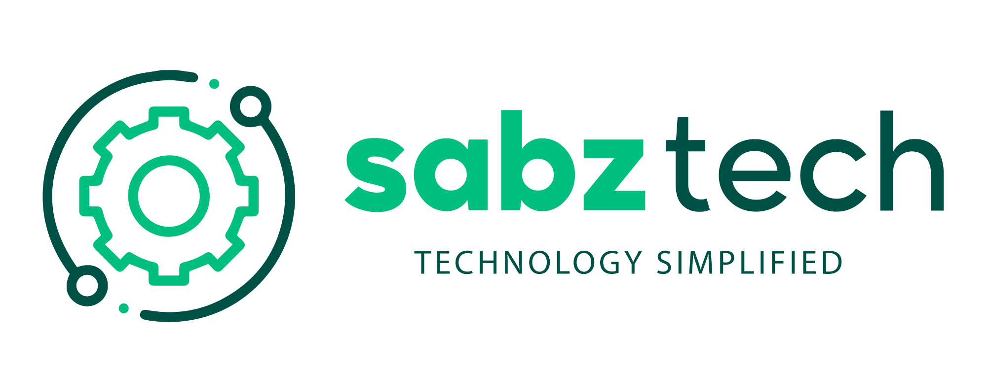
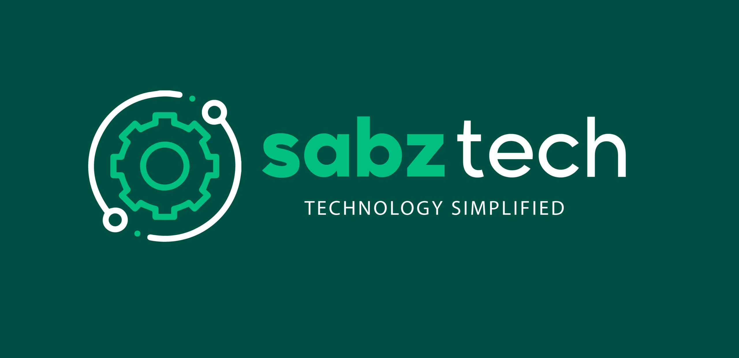
The logo was designed to be bold yet minimal, built on strong symbolism to communicate both round-the-clock service and technological prowess.
The Logo
🔁 The Orbit — Represents constant evolution and 24/7 support. It’s a visual nod to the seamless nature of Sabz Tech’s service.
⚙️ The Wheel (Gear) A universal symbol of technology, systems, and problem-solving all at the heart of what Sabz Tech delivers.
🔵 The Dots Indicate movement, progress, and the global nature of their work.
Every element was intentional from the green color symbolizing growth and logic to the circular motion representing continuity and agility.
the impact
A cohesive brand identity that aligns with global tech expectations
A logo and brandmark that’s versatile across digital and print
Created clarity in brand communication internally and externally
Helped establish Sabz Tech as a credible, modern IT partner